
Sadly, I have another wasn’t-meant-to-be challenge photo for you this week. This one’s a bit different than last time, though. I didn’t run out of time to submit it.
This time, I couldn’t get past my own perfectionist tendencies.
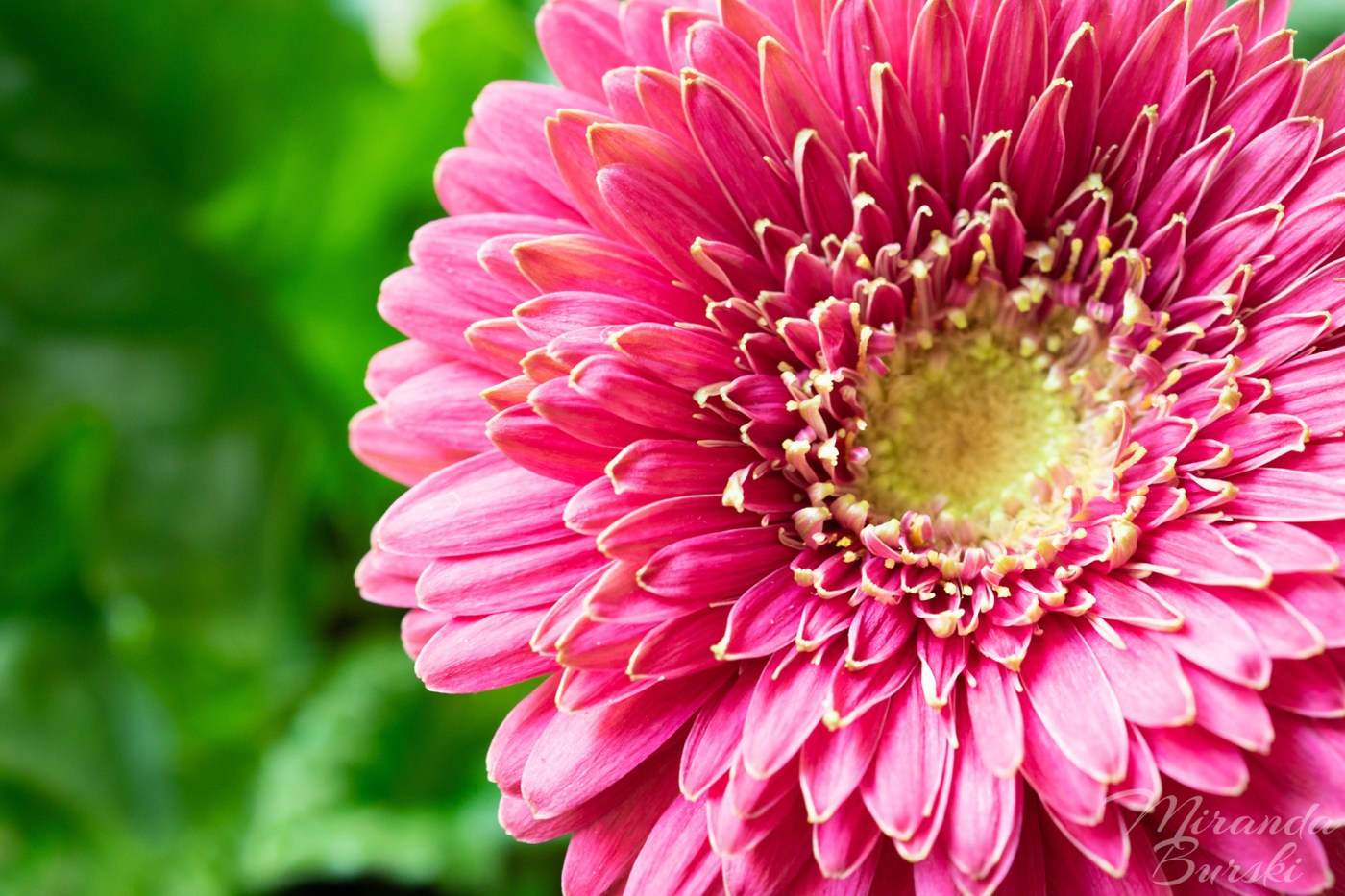
The theme for the challenge, which was a couple of weeks ago now, was “Complimentary colours.” Easy enough, right? I found my subject: one of the flowers in the plant a recent coworker gave to me.
I was happy with how the subject fit the theme. What I wasn’t happy with was how the subject looked in the photos.
No matter what I did, I couldn’t get the depth of field where I wanted it. If it was too short, I didn’t get the centre of the flower and the petals in focus like I wanted. But too long, and I ended up with the leaves in the background looking too clear.
The photo above was the one I was most okay with, but I couldn’t bring myself to submit it. I should have. Something is better than nothing, right?
Next time, maybe I’ll do better at forcing myself.

Leave a comment